Visualizing Cortical Thickness In a Population
Today my goal is to develop some methods for comparing an individual's neuroanatomy to a population's and make some graphs that help convey my findings. To demonstrate this I will be using the Pediatric Template of Brain Perfusion (PTBP), which has already been processed and can be found here.
I'll start off by loading some libraries I'll need and the CSV file. The CSV file contain demographics data and anatomically specific information about the cortical thickness, fractional anistrophy, cerebral blood flow, and blood oxygenation level. For now I'm just going to focus on cortical thickness (found by the prefix “Thick*”).
R provides a lot of great ways of quickly visualizing data. For example…
Here I look at how age and sex interact to influence.
It's easier to see now that most of the lines' confidence intervals overlap (the shaded regions are the 0.95 confidence interval). It looks like the only truly signifcant area of difference between sexes would be as they get older (Again, this may be due to a variety of unkown factors. Perhaps females have undergone more pruning at this stage because they are developmentally more advanced at 18 than males.) It is interesting however that both follow the same general trend and neither deviates greatly over the 13 year period this covers.
We can produce more tangible statistics by fitting the data to a linear model as follows.
Fortunately, we are using such a dataset and later I'll show how we can use that to our advantage.
I'll start off by loading some libraries I'll need and the CSV file. The CSV file contain demographics data and anatomically specific information about the cortical thickness, fractional anistrophy, cerebral blood flow, and blood oxygenation level. For now I'm just going to focus on cortical thickness (found by the prefix “Thick*”).
 |
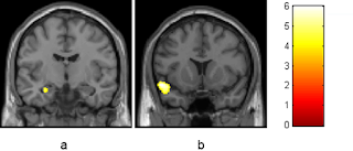
| Picture of amygdala from recent paper on the effects of cannabis |
suppressPackageStartupMessages(library(dplyr))
suppressPackageStartupMessages(library(ggplot2))
home <- '/Users/zach8769/'
ptbp <- read.csv(paste(home, 'Desktop/ptbp/data/ptbp_summary_demographics.csv', sep = ""), header = TRUE)
thick_ptbp <- ptbp %>% select(1:132) %>% select(-ThickMeanVermis_3, -ThickMeanCerebelum_3_L, -Anatomy)
thick_ptbp <- thick_ptbp[, colSums(!is.na(thick_ptbp)) > 0] # get rid of columns of just NA
amyg <- thick_ptbp %>% select(1:13, ThickMeanAmygdala_L, ThickMeanAmygdala_R) %>%
  filter(!is.na(ThickMeanAmygdala_L), !is.na(ThickMeanAmygdala_R)) %>%
  mutate(Amygdala = (ThickMeanAmygdala_L + ThickMeanAmygdala_R) / 2)
ggplot() + geom_density(data = amyg, aes(Amygdala, colour = Sex)) + xlab("Thickness in millimeters")
R provides a lot of great ways of quickly visualizing data. For example…
plot(amyg)
summary(amyg$Amygdala)
##    Min. 1st Qu.  Median    Mean 3rd Qu.    Max.
##   3.240   4.674   4.990   4.925   5.255   5.762
Here I look at how age and sex interact to influence.
ageplot <- ggplot(amyg, aes(AgeAtScan, Amygdala))
ageplot + geom_point(aes(colour = Sex)) + stat_smooth(aes(fill = Sex, colour = Sex)) + xlab("Age (y.o.)") + ylab("Amygdala Thickness (mm)")
It's easier to see now that most of the lines' confidence intervals overlap (the shaded regions are the 0.95 confidence interval). It looks like the only truly signifcant area of difference between sexes would be as they get older (Again, this may be due to a variety of unkown factors. Perhaps females have undergone more pruning at this stage because they are developmentally more advanced at 18 than males.) It is interesting however that both follow the same general trend and neither deviates greatly over the 13 year period this covers.
We can produce more tangible statistics by fitting the data to a linear model as follows.
agefit <- lm(Amygdala ~ AgeAtScan * Sex - 1, amyg)
summary(agefit)
##
## Call:
## lm(formula = Amygdala ~ AgeAtScan * Sex - 1, data = amyg)
##
## Residuals:
##      Min       1Q   Median       3Q      Max
## -1.74283 -0.22535  0.07175  0.30422  0.86327
##
## Coefficients:
##                Estimate Std. Error t value Pr(>|t|)
## AgeAtScan      -0.01276    0.01471  -0.867   0.3869
## SexF            5.04417    0.18527  27.226   <2e-16 ***
## SexM            4.54870    0.21690  20.972   <2e-16 ***
## AgeAtScan:SexM  0.04619    0.02246   2.057   0.0412 *
## ---
## Signif. codes:  0 '***' 0.001 '**' 0.01 '*' 0.05 '.' 0.1 ' ' 1
##
## Residual standard error: 0.4505 on 177 degrees of freedom
## Multiple R-squared:  0.9919, Adjusted R-squared:  0.9917
## F-statistic:  5410 on 4 and 177 DF,  p-value: < 2.2e-16
Fortunately, we are using such a dataset and later I'll show how we can use that to our advantage.


Comments
Post a Comment